5 Reasons Your Shopify Store Isn’t Converting 2026
Discover the five most common Shopify product page mistakes that reduce conversions, and learn practical ways to improve your store’s shopping experience and increase sales.
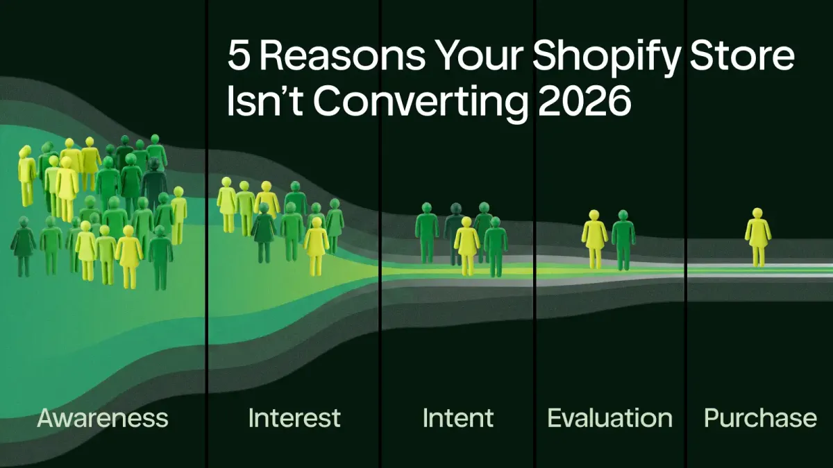
The product isn’t the problem. The experience is.
Across the Shopify stores we analyze, conversion problems rarely come from one obviously broken element. The ads were bringing visitors. Traffic wasn’t bad. Customers who bought it left positive reviews. From the outside, nothing looked obviously broken.
But the store still wasn’t converting. After reviewing the store, the reason became clear. It wasn’t one big problem.
It was dozens of tiny moments where shoppers had to stop, think, or look a little harder than they expected. That’s how most conversion problems happen.
Not because people dislike the product.
Because buying starts to feel like work.
1. Everything on your product page looks equally important.
When everything on a product page is trying to grab attention, nothing stands out.
- Bright badges
- Large and bold text
- Pop-ups
- Icons
- Promotional banners
- Product labels
Each element may seem useful on its own. But together, they compete for attention instead of guiding shoppers toward a purchase.
A good product page doesn’t ask visitors where to look next.
It tells them.
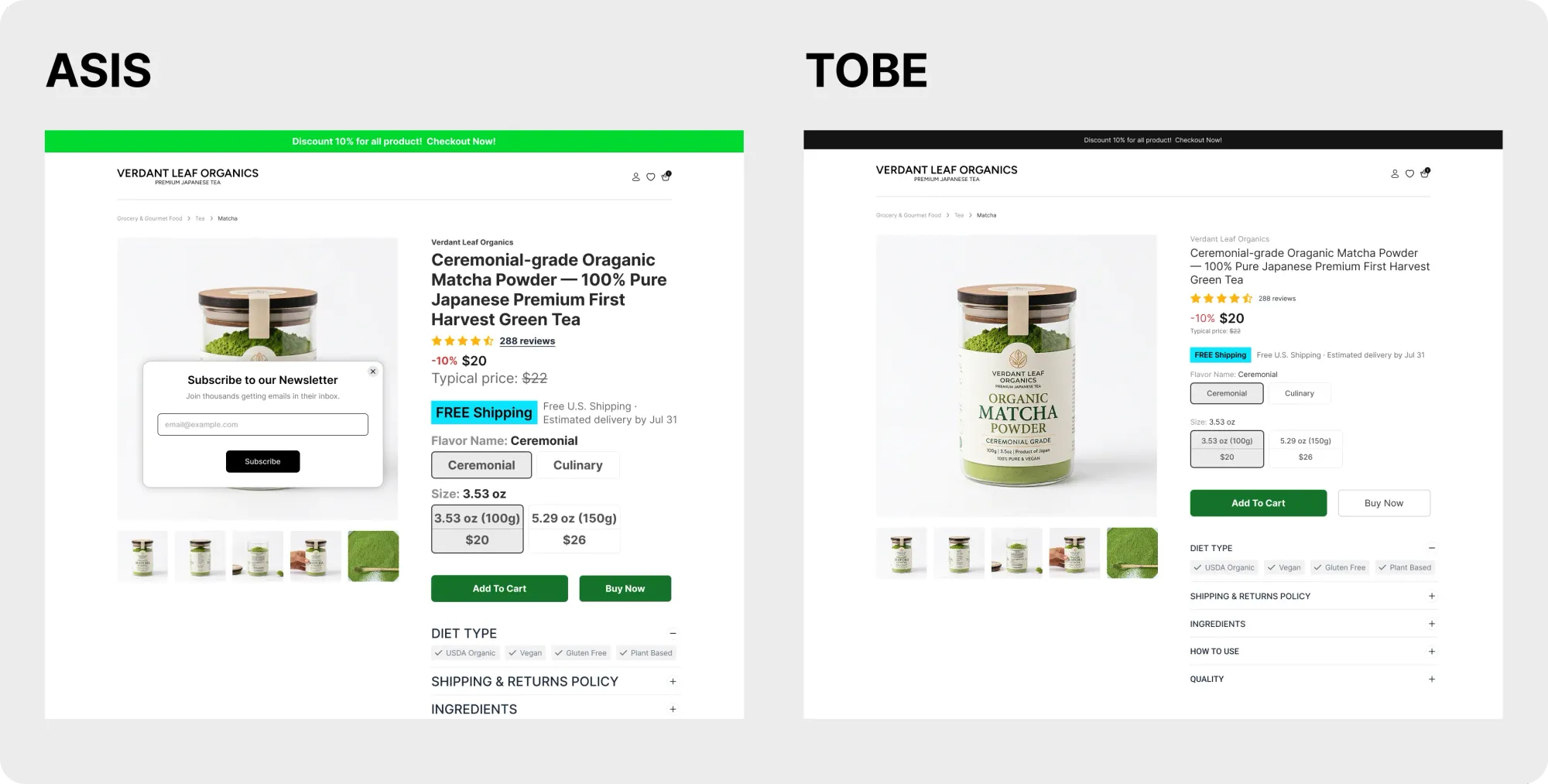
Create a clear visual hierarchy that guides shoppers through the page.
✓ Make your product title and value proposition the first thing visitors notice
✓ Give your Add to Cart button enough contrast to stand out
✓ Group related information together instead of scattering it across the page
✓ Use spacing and typography to show what's most important
The easier your page is to scan, the easier it is to buy.
2. Your product title tells shoppers what it is. It doesn’t tell them why it matters.
This is one of the most common problems we see.
A product title like ”Organic Matcha Powder” is accurate.
But so are dozens of other products.
What shoppers really want to know is why this one deserves their attention.
Compare these two examples:
Organic Matcha Powder
vs
Ceremonial-grade Organic Matcha Powder — 100% Pure Japanese Premium First Harvest Green Tea
The first simply names the product.
The second gives shoppers a reason to keep reading.
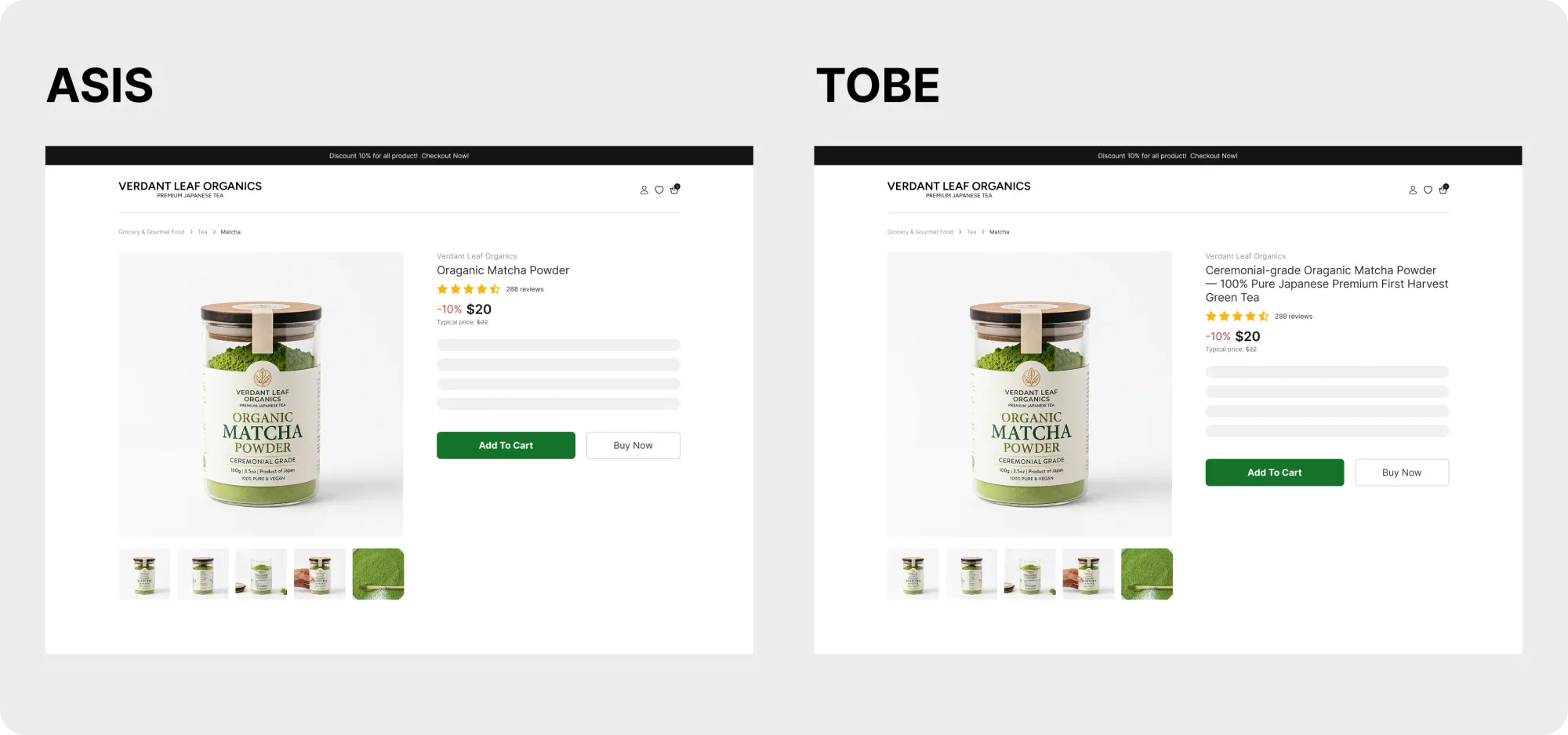
Keep your product title clear, then pair it with a short value proposition.
✓ Explain what makes your product different
✓ Focus on the outcome or benefit, not just the feature
✓ Help shoppers understand why they should choose your product over similar alternatives
Your title identifies the product. Your value proposition sells it.
3. Your most reassuring information shouldn’t be hidden below the fold.
- Shipping
- Returns
- Customer Reviews
- Delivery estimates
They’re often on the page—but they’re not always where shoppers need them.
By the time shoppers find that information, they may have already started doubting the purchase.
Reassurance works best before hesitation begins.
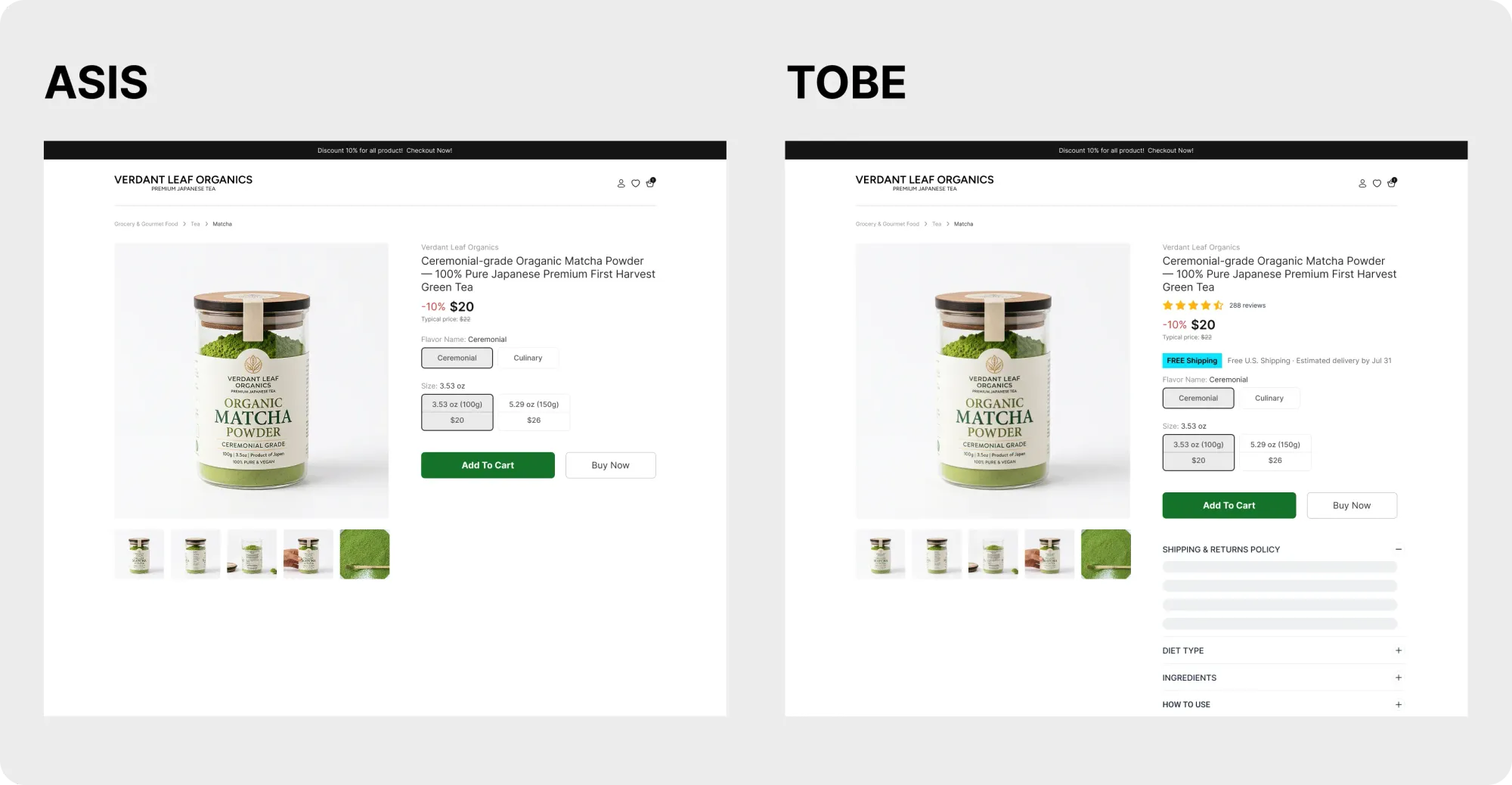
Bring confidence: building information closer to the Add to Cart button.
✓ Display review ratings where shoppers can see them immediately
✓ Make shipping and return policies easy to find
✓ Set clear delivery expectations before visitors have to search for them
The easier reassurance is to find, the easier buying becomes.
4. Don’t make choosing the product harder than buying it.
Some stores turn a simple purchase into a series of decisions.
- Size
- Color
- Pack size
- Subscription or one-time purchase
- Bundle options
None of these are bad on their own.
But if shoppers have to stop and think about every choice, buying starts to feel like work.
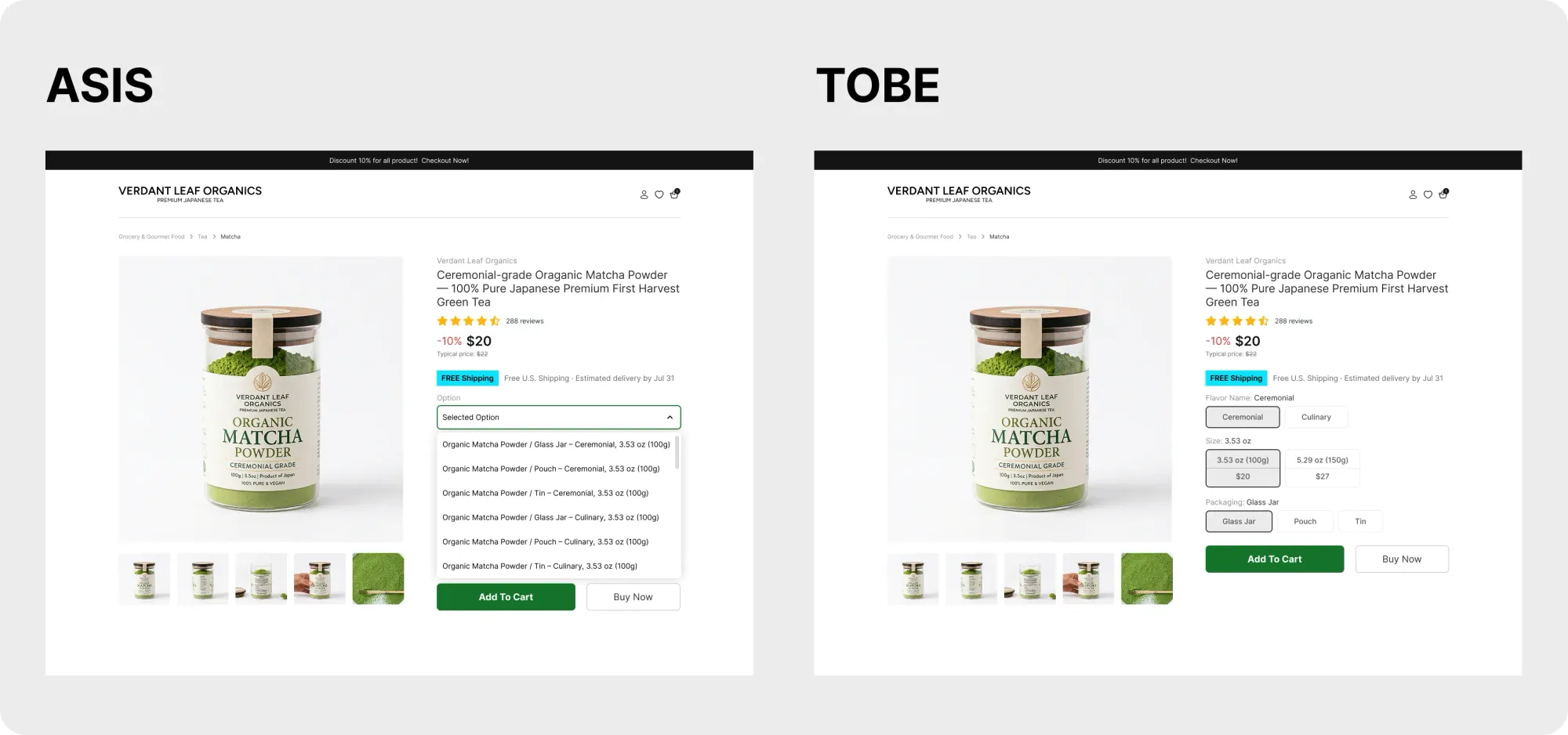
Make choosing the right option as easy as possible.
✓ Highlight the recommended option
✓ Explain the difference between variants
✓ Pre-select the most common choice when appropriate
✓ Keep option labels simple and descriptive
The easier it is to choose, the easier it is to buy.
5. Your images should answer questions, not just look good.
Beautiful product photography can grab attention.
But great product images help people make a decision.
When shoppers look through your gallery, they’re trying to answer questions.
- How big is it?
- What does it look like in real life?
- How is it used?
- What makes it different?
If your images don’t answer those questions, shoppers are forced to imagine the product for themselves. And uncertainty rarely leads to a purchase.
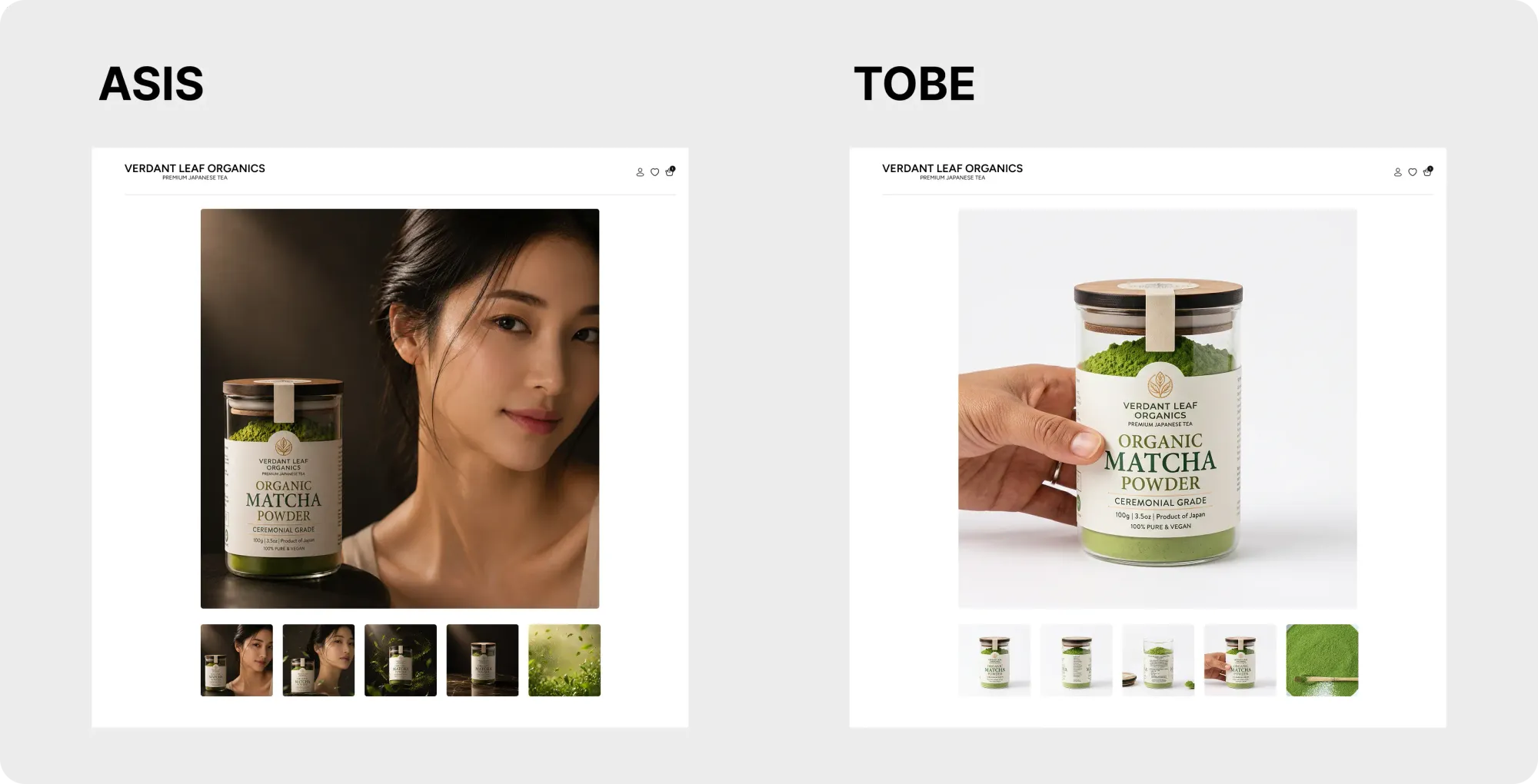
Let your images do more than showcase the product.
✓ Include lifestyle photos that show the product in use
✓ Add close-up images to highlight important details
✓ Show scale, dimensions, or size comparisons
✓ Use comparison or before-and-after visuals when relevant
The best product images don’t just look good—they help shoppers feel confident about what they’re buying.
Closing
When people talk about improving conversions, they often focus on getting more traffic. But bringing more traffic to a confusing product page only exposes more shoppers to the same friction.
We’ve found it more useful to focus on reducing hesitation.
Because every visitor who lands on your store has already made one decision: they clicked.
The next decision—whether they buy—is shaped by dozens of tiny moments that happen after that. Those are the moments where conversions are won or lost.
These moments are surprisingly easy to miss, especially when you look at the same store every day and already know where everything is.
That visibility gap is exactly why we built Gentoo.
Gentoo continuously audits your Shopify storefront and product catalog to uncover small moments of friction that may be reducing conversions. Then it recommends improvements you can review and approve or, if you prefer, publish automatically.
If you’re curious how it works, you can explore Gentoo on the Shopify App Store.