On this page
Shopify Product Page Optimization: 10 Practical Checks
Improve Shopify product pages with clearer value, proof, compatibility, shipping and mobile choices before increasing ad spend.

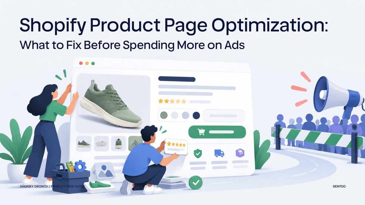
Shopify product page optimization helps a customer choose the right item, understand its value and complete the next purchase step. Start with variants, essential product facts, credible proof, delivery and the mobile buying task. Improve the part that leaves a real question unanswered.
Your product page may be the reason more traffic is not helping
If your Shopify store has a good product but weak conversion, increasing ad spend may not solve the problem. More traffic helps only when the product page gives the right visitors a reason to continue. A visitor needs to understand:
- what the product is;
- who it is for;
- why it is valuable;
- why it is different;
- whether it will work for them;
- what happens after purchase.
A good product page does more than look polished. It answers the questions that keep a good-fit shopper from buying.
Run one product-page test before editing the template
Choose an important product and give the page a concrete task: “Buy the correct size for this use and find out what delivery will cost.” Start from the landing page a customer actually sees, on a phone. Record the first question the page fails to answer.
- Select every relevant option. Check that the selected label, image, price, availability and item added to the cart agree.
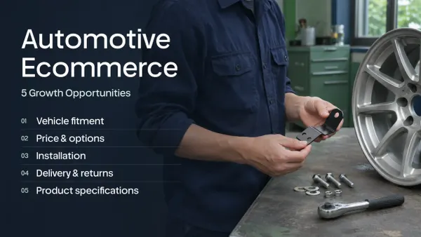
- Find the decision facts without prior product knowledge: dimensions or pack size, ingredients or materials, and verified fit or usage information.
- Open the review, delivery and return information from the buying area. Confirm the terms apply to this product and destination.
- Add the chosen variant to the cart, change its quantity and return to the page. Check that the customer can still understand the selection.
| Before | More useful presentation | Check before publishing |
|---|---|---|
| Option labels say only “Small” and “Large” | Show the actual size or quantity beside each option | The label matches the variant and the item received |
| A coffee page says “Choose your grind” with no guidance | Explain which available grind fits each supported brewing method | The product team confirms the guidance |
| The page says only “Easy returns” | Summarize the applicable eligibility and link to the full policy | Opened items, exclusions and deadlines match the real policy |
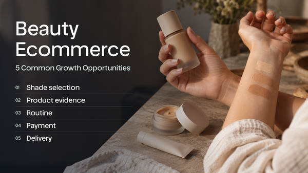
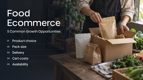
Our review of 110 beauty stores includes shade selection, product evidence and subscription clarity. The 70 food-store examples cover grind choice, pack size and delivery conditions. These are category-specific investigations; they do not establish a conversion lift from any one edit.
Keep a record of the affected products and release date. Check purchases and returns alongside option questions and cart additions. For illustrated page-layout examples, continue with five product-page mistakes and fixes.
Start with the product-page job
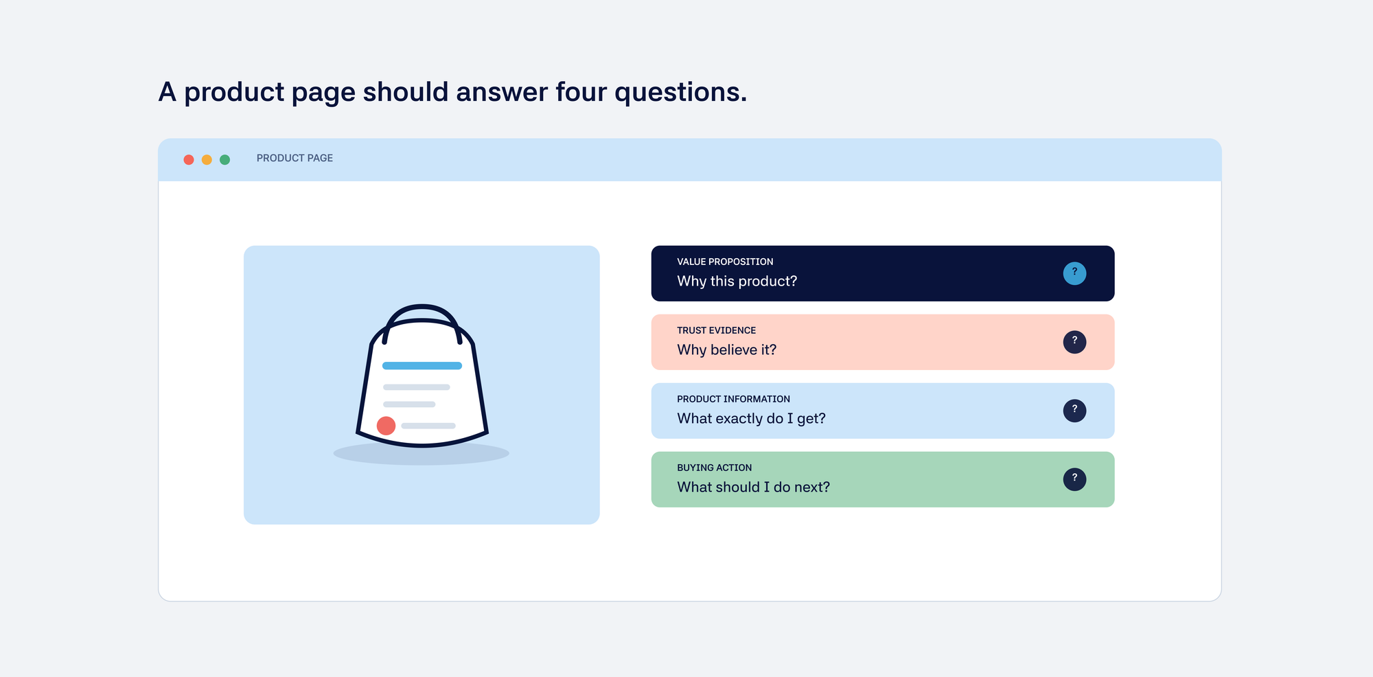
A product page has to support a purchase decision. It should answer:
- What is this product?
- Is it relevant to me?
- Why is it worth the price?
- Can I trust the product and the merchant?
- What should I do next?
The page should reflect the product category, price, audience, buying cycle, and business goal. A low-cost impulse purchase and a premium technical product should not use the same product-page strategy.
1. Make the value proposition clear
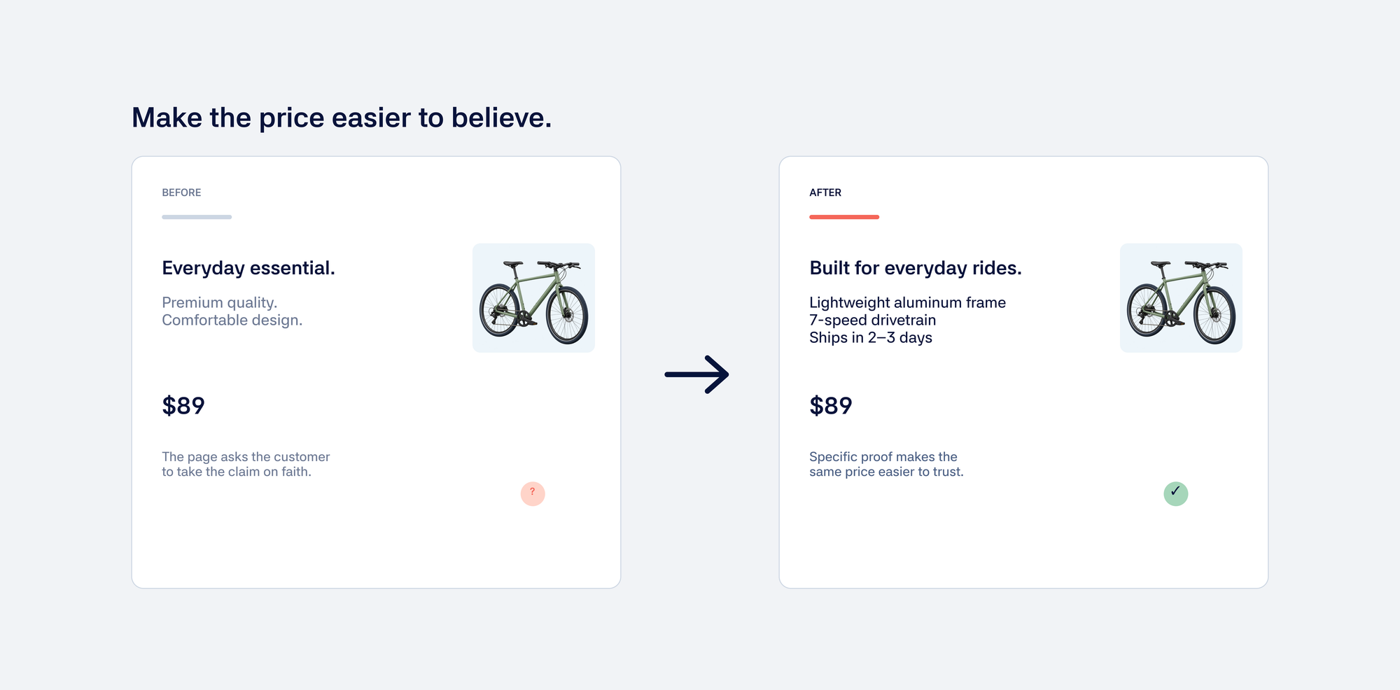
Use the product title to identify the item, then answer the next practical question in a short value statement. For an illustrative commuter rain jacket, “Waterproof shell with sealed seams” is more useful than “Premium quality for every adventure,” provided those construction details are accurate.
| Page element | Illustrative copy | What to verify |
|---|---|---|
| Title | Lightweight commuter rain jacket | A clear product identity |
| Value statement | Sealed seams and a packable hood for wet commutes | Construction and intended use |
| Fit guidance | Compare your measurements with the garment size chart | Actual dimensions and sizing policy |
| Delivery and returns | Link to the current delivery estimate and return terms | Current operational terms |
2. Explain why the product is worth its price
Price becomes a conversion problem when the page does not provide enough justification. This is especially important for premium products. The page may need to explain:
- materials;
- craftsmanship;
- performance;
- durability;
- sourcing;
- expected results;
- support;
- warranty;
- comparison with cheaper alternatives.
A high price may be acceptable when the page explains what the shopper gets for it. For example, “premium construction” tells a shopper little. A materials close-up, an explanation of what the material changes in everyday use, and a clear warranty give the price some context. This is an illustrative copy change, not a claim that a particular wording will increase sales.
3. Provide the product information shoppers need
The right information depends on the product. Depending on the category, shoppers may need:
- dimensions;
- compatibility;
- ingredients;
- materials;
- technical specifications;
- care instructions;
- use cases;
- setup instructions;
- delivery timing;
- returns;
- stock information.
Missing information creates friction even when the product itself is a good fit.
4. Use proof where uncertainty is highest
Reviews are useful, but proof should match the shopper’s concern. Useful proof may include:
- customer reviews;
- user-generated content;
- demonstrations;
- comparison charts;
- expert opinions;
- case studies;
- product testing;
- guarantees.
Choose proof that answers the shopper’s main concern.
5. Improve images and demonstrations
Images should explain the product, not just decorate the page. Consider whether the images show:
- scale;
- use;
- important details;
- different angles;
- product quality;
- compatibility;
- the result after use.
For complex products, a video or visual demonstration may answer questions that copy cannot.
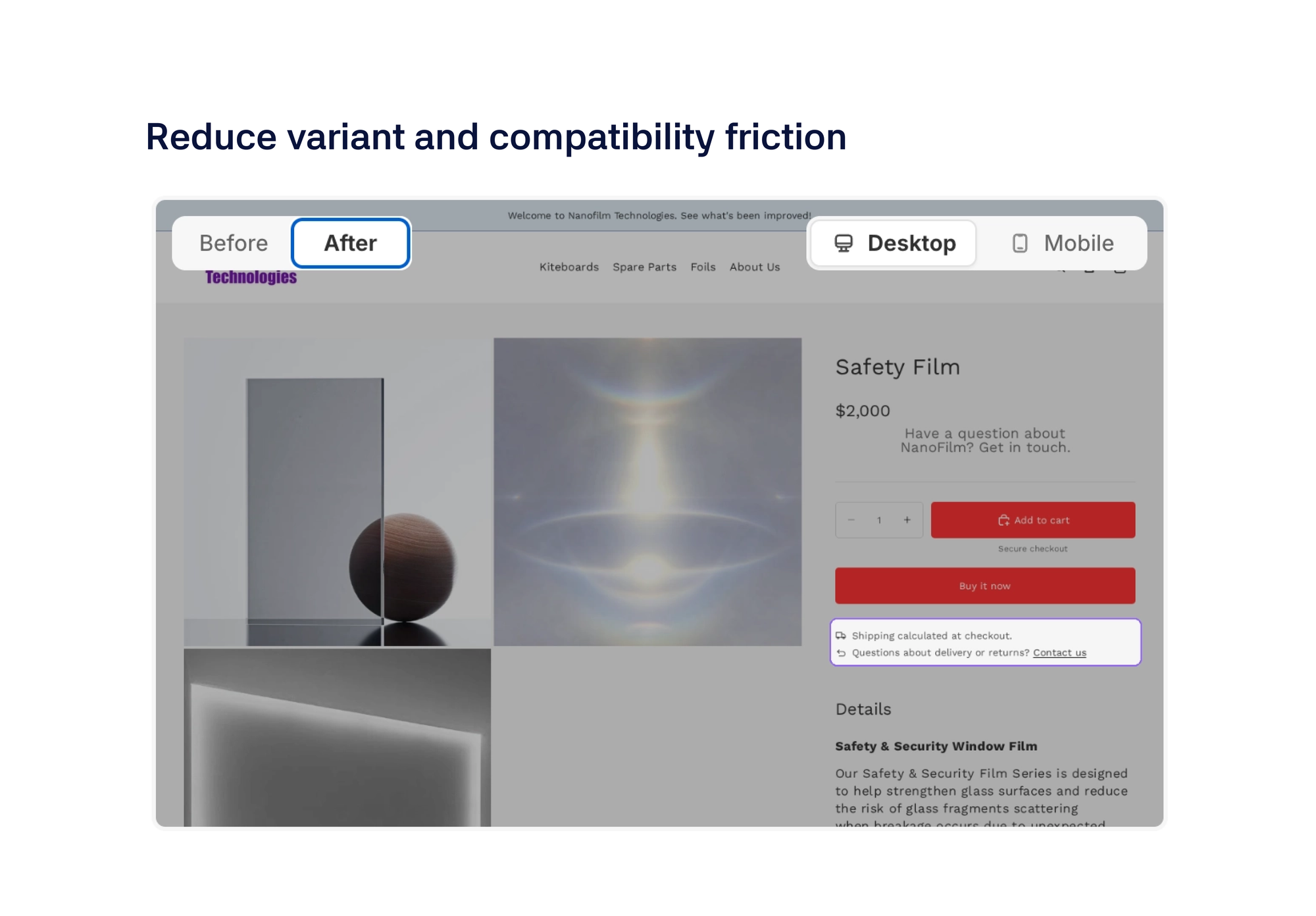
6. Reduce variant and compatibility friction
Variant selection becomes difficult when the shopper is unsure what to choose. This is common with:
- technical products;
- clothing sizes;
- replacement parts;
- bundles;
- color or configuration options;
- products that depend on compatibility.
Make the choice easier with clear labels, guidance, compatibility information, and useful warnings.
7. Make shipping and returns visible
Shipping and returns are part of the purchase decision. Do not force shoppers to search through the site for:
- delivery time;
- shipping cost;
- return window;
- return conditions;
- international restrictions;
- duties or taxes;
- warranty information.
Uncertainty about what happens after purchase can prevent a shopper from adding the product to the cart.
8. Make the primary action obvious
A product page should make the next step clear. Review:
- add-to-cart placement;
- button copy;
- variant selection;
- sticky mobile actions;
- subscription or one-time purchase choices;
- quantity controls;
- availability messaging.
A clear call to action helps, but it cannot rescue weak product information. A confusing one adds friction.
9. Review recommendations carefully
Related products, bundles, and upsells can help customers discover more value. They can also distract shoppers from the main purchase. Recommendations should help the shopper complete the main purchase, not just increase the number of products on screen.
10. Review the mobile experience
On mobile, product-page friction can appear in:
- image browsing;
- page length;
- variant selection;
- sticky add-to-cart;
- product details;
- reviews;
- pop-ups;
- loading speed.
Check the mobile journey itself. A responsive layout does not guarantee an easy experience.
What to fix before spending more on ads
Before increasing traffic, check whether visitors are:
- reaching the right product page;
- understanding the product;
- engaging with the information;
- selecting a variant;
- adding the product to the cart;
- leaving after encountering an unanswered question.
If the product page is the bottleneck, more traffic may simply create more expensive non-converting sessions. A useful starting diagnosis is:
- High traffic but low product engagement: check message match and product-page clarity.
- High product views but low add-to-cart rate: check value, proof, price justification, and fit.
- High add-to-cart rate but low purchase rate: check shipping, returns, cart messaging, total cost, and checkout.
Use these patterns as starting points. Check them against store data and the merchant’s goal before making a change.
Measure the change, not just the button click
Record the product-page segment, traffic source, and device before changing the page. Compare add-to-cart behavior with purchases, revenue per session, and returns. A higher add-to-cart rate is not a win if shoppers buy the wrong variant or abandon later. For the next step in that journey, see the Shopify checkout optimization guide.
A product-page improvement from Vom Fass
At Vom Fass, Gentoo added related products to selected landing pages and purchase links inside recipe articles. That connects an existing shopper task, such as following a recipe, with the products needed to complete it.
For your own store, follow the link from the article to the product on a phone. Check that the item is available, the relevant variant is clear and the page explains how it fits the recipe. Check whether readers reach the relevant product and complete a purchase before expanding the approach.
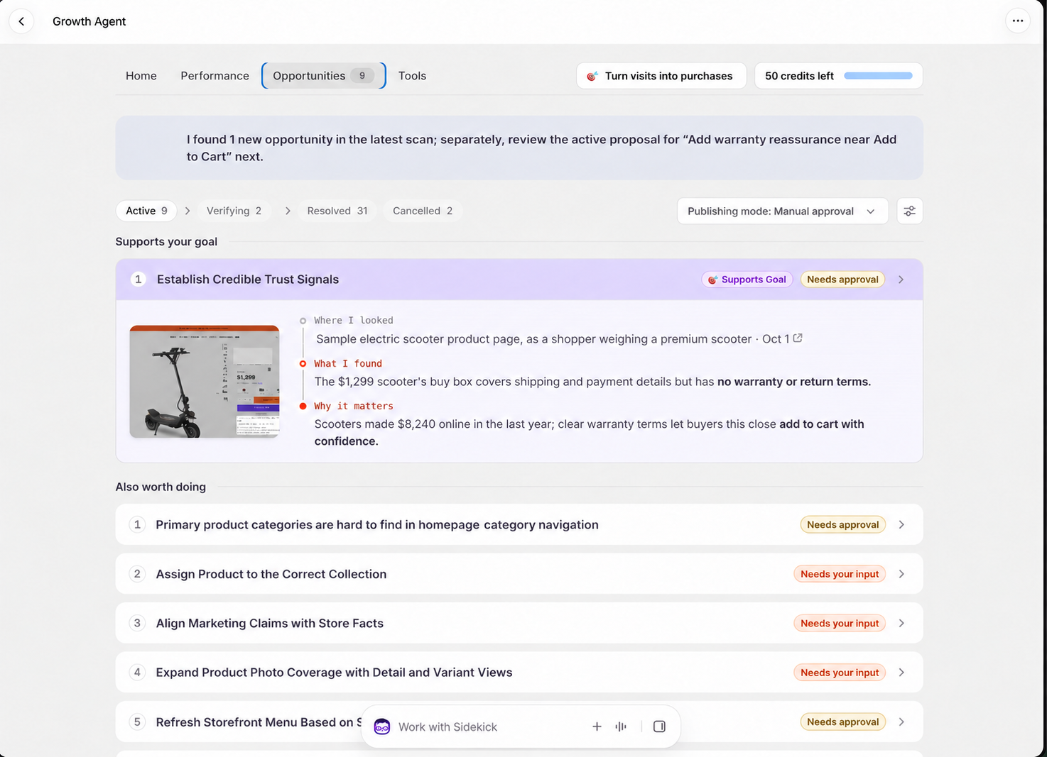
Gentoo uses the store’s goal to decide whether a product-page change deserves attention. It prepares the proposed work, executes after approval and checks the outcome before choosing what follows.
Unsure which product-page question is costing you purchases? Grow with Gentoo — Free
Check the journey after the page edit
A clearer product page should make the next step easier. Review cart additions alongside completed purchases, returns and support questions. If shoppers still cannot find the right product, work on store navigation and discovery as well.